Overview
In several recent client and personal projects, I’ve found a need to quickly create robust real-time anomaly detection for time series data. In the typical use case, the goal is to fit a model to as much historical data as possible, then use that model to predict future time series values. When the predictions are compared against new observed data, if the observed data appears to fall too far away from the predicted values, it is flagged for follow-on analysis.
Because time series forecasting models are typically meant to fit on a single, one-dimensional set of time series data, it can be challenging to develop multiple models simultaneously on high-dimensional data, such as across a number of sensors, stock symbols, etc. Moreover, analysts who have to monitor and act on the output of such models can’t be expected to have the intimate knowledge needed to refine and tune the model parameters to improve their performance. For this reason, the ideal modeling framework should work well out of the box, without requiring hyperparameter optimization.
Robust, automated, accurate time series forecasting is one of the objectives of Facebook’s open-source Prophet package for Python and R. According to the documentation, “It works best with time series that have strong seasonal effects and several seasons of historical data. Prophet is robust to missing data and shifts in the trend, and typically handles outliers well.” Sounds great! I was also aware of some other auto-forecasting packages for time series data in R, including forecastHybrid and the classic auto.arima from the forecast package. The latter two packages are related in the sense that forecastHybrid uses an optimized weighted average of multiple forecasting methods, including ARIMA, each of which is fit separately to the data prior to determining weights. On the other hand, Prophet follows a generalized additive model framework, with terms for trend, seasonality, holiday and error, and which “is inherently different from time series models that explicitly account for the temporal dependence structure in the data” (see p. 7 of https://peerj.com/preprints/3190/).
I wanted to take an objective look at these packages and compare them in four primary dimensions:
- Forecast accuracy (i.e. accuracy of point forecasts)
- Prediction interval accuracy (i.e. if a package forms a 100p% prediction interval, it should contain close to 100p% of the test data points)
- Fitting and forecast speed
- Reliability when using at scale
My loose hypothesis in starting this study was that, due to their flexibility, forecastHybrid or Prophet would perform best, and that auto.arima would struggle on data that has long-term, non-seasonal trends.
Data Selection and Preparation
I chose the Seattle Road Weather Information Stations dataset from Kaggle, which I felt would provide a good test bed, due to incorporating enough data to fit seasonal models at multiple time scales yet also having some extreme events, having observations in parallel from multiple weather stations, and also being maintained by Kaggle. I downloaded the data locally to work with it.
What does it look like?
library(data.table)
library(dplyr)
library(ggplot2)
library(lubridate)
library(magrittr)

raw_seattleWeather = fread("data/city-of-seattle/seattle-road-weather-information-stations/road-weather-information-stations.csv",
    nrows = 1e+07, header = TRUE, drop = c("StationLocation")) %>% unique() %>%
    mutate(DateTime = as_datetime(DateTime))
##
Read 15.3% of 10000000 rows
Read 27.2% of 10000000 rows
Read 38.6% of 10000000 rows
Read 46.9% of 10000000 rows
Read 58.9% of 10000000 rows
Read 70.8% of 10000000 rows
Read 81.3% of 10000000 rows
Read 87.9% of 10000000 rows
Read 99.8% of 10000000 rows
Read 10000000 rows and 5 (of 6) columns from 4.154 GB file in 00:00:11ggplot(raw_seattleWeather, aes(DateTime, AirTemperature)) + geom_line() + facet_grid(StationName ~
.)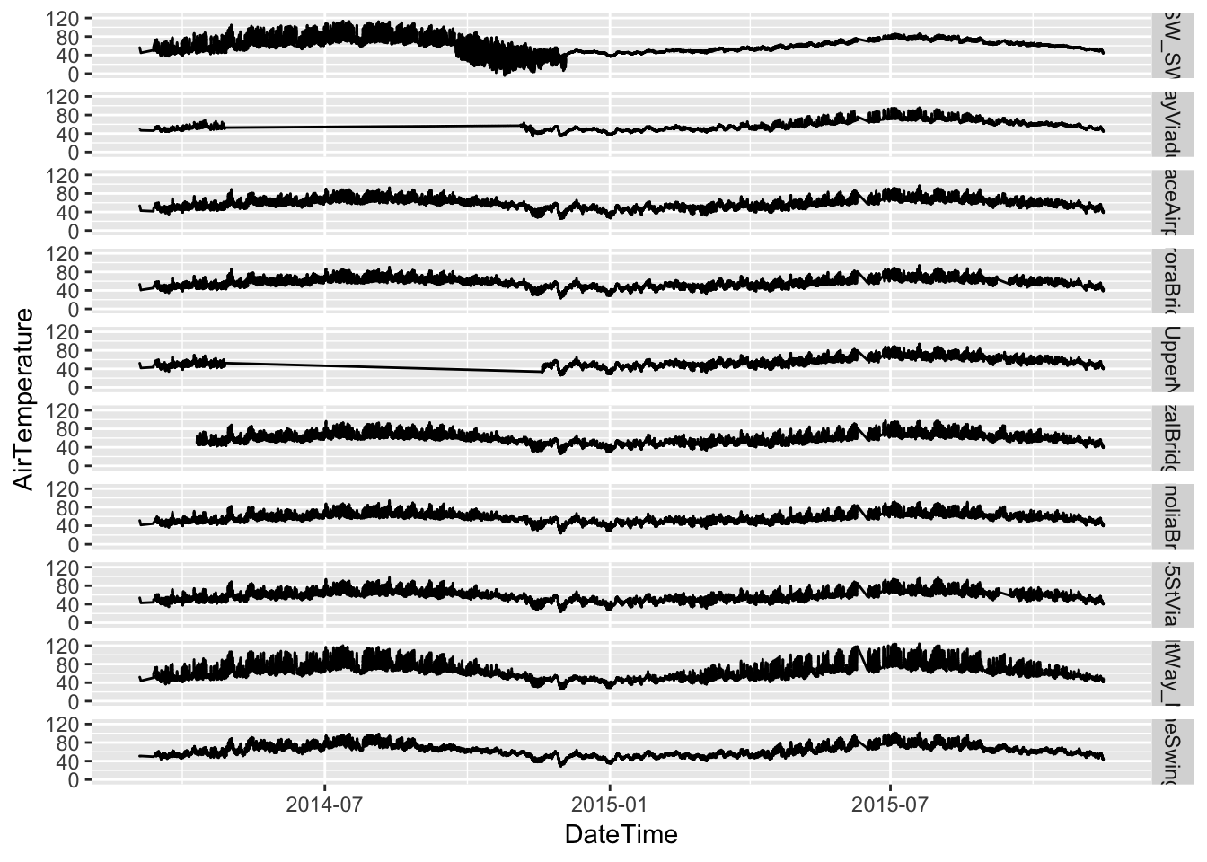
Two of the stations are missing several months of observations, while another starts a month or two later than all the rest. Let’s remove these from the data.
raw_seattleWeather %>% group_by(StationName) %>% summarise(num_obs = n()) %>%
    arrange(-num_obs)
## # A tibble: 10 x 2
## StationName num_obs
## <chr> <int>
## 1 35thAveSW_SWMyrtleSt 843296
## 2 AlbroPlaceAirportWay 842261
## 3 SpokaneSwingBridge 841832
## 4 MagnoliaBridge 836211
## 5 RooseveltWay_NE80thSt 833595
## 6 NE45StViaduct 830228
## 7 AuroraBridge 827357
## 8 JoseRizalBridgeNorth 802174
## 9 AlaskanWayViaduct_KingSt 566123
## 10 HarborAveUpperNorthBridge 553851It looks like these three stations are HarborAveUpperNorthBridge, AlaskanWayViaduct_KingSt and JoseRizalBridgeNorth.
raw_seattleWeather = raw_seattleWeather %>% filter(!(StationName %in% c("HarborAveUpperNorthBridge",
    "AlaskanWayViaduct_KingSt", "JoseRizalBridgeNorth")))
At this point, there are a few more steps to take before the data is ready to model. For the sake of keeping this blog post readable, all of the functions I used to finalize the data prep can be found in my github repo for this project, specifically in the compare_forecasts.R script. In a nutshell, I
- create a master set of timestamps, using the min and max time observed over all stations in the raw data
- make sure there are observations for all possible timestamps for each station, using the zoo::na.approx method to interpolate values where they don’t exist
- get the average temperature for each hour for each station
Although Prophet is built to handle missing data, the same is not true for the packages in general, hence the decision to interpolate missing timestamps.
Iterative Data Sampling and Model Fitting
It is important to compare the three packages using homogeneous training data samples, and to account for factors that could bias the results. Those factors include the length of the training data, the number of periods to forecast and the station where temperature is measured. We will specifically control for these in the study by generating common train and test sets at random points in time (where the train and test periods are adjacent) the same number of times for each station. I chose to use training period lengths of 24, 168, 672 and 2688 hours, and test period lengths of 4, 24, 168 and 672 hours. The call for this procedure looks like this:
source("scripts/compare_forecasts.R")
library(data.table)

raw_data = fn_get_raw_data()

clean_data = fn_fill_ts_na(raw_data)

rm(raw_data)
gc()

station_names = clean_data %>% select(StationName) %>% unique()
station_names = as.vector(station_names[["StationName"]])
model_results_list = list()
for (s in station_names) {
    set.seed(as.integer(Sys.time()))
    model_results_list[[s]] = fn_compare_forecasts_main(raw_data = clean_data[clean_data$StationName ==
        s, ], arg_train_lengths = c(24, 168, 168 * 4, 168 * 4 * 4), arg_test_lengths = c(4,
        24, 168, 168 * 4), arg_num_reps = 3)
    gc()
}
A major issue with this approach was the fact that Prophet kept throwing C++ errors after several hundred rounds of fit + predict. I believe this is related to a known Prophet issue, which is theoretically resolved, but still didn’t work for me (using prophet version 0.4). So while I would have liked to just set arg_num_reps to 20 or 30 and let it run, I had to break it up into batches of 3-5 reps until collecting 24 reps total.
One other key setup decision was to use only the ARIMA, ETS and Theta models in fitting the forecastHybrid models. This was done to save computation time (a serious issue especially when including the neural network model), and because the SLTM and TBATS models did not seem to offer much improvement when added to the three listed previously.
The metrics of interest are MAPE for point forecast accuracy, and the proportion of prediction intervals containing the corresponding test data points for interval accuracy. Both of these are computed within the forecast generation process, so that each model result contains each of these as summary metrics (but does not contain all the raw predicted and test values).
Model Comparison
After running all the batches of model iterations, let’s read them in for analysis.
output_files = c()
for (f in list.files("output/", pattern = "output_*")) {
    output_files = append(output_files, paste0("output/", f))
}
model_results = do.call(rbind, lapply(output_files, fread))
Point Forecast Accuracy
Let’s first take a look at the overall accuracy of the forecast methods.
ggplot(data = model_results, aes(x = forecast_method, y = mape)) + geom_violin(aes(color = forecast_method)) +
    facet_grid(train_length ~ test_length, scales = "free", labeller = label_both) +
    theme(axis.text.x = element_text(angle = 90, hjust = 1)) + ggtitle("MAPE vs. Method by Training and Test Lengths")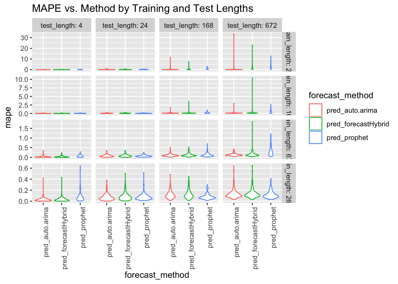
At this level, some themes emerge:
- accuracy for all of the methods degrades as the test period length increases
- when there is little training data, auto.arima tends to outperform the other two methods
- when there is a lot of training data, the methods become rather comparable
Some of the metrics are hard to see due to the long-tailed distributions, so let’s dive in a little deeper by training length and test length.
ggplot(data = model_results, aes(x = train_length, y = mape)) + geom_quantile(quantiles = c(0.5)) +
    geom_quantile(quantiles = c(0.05, 0.95), linetype = c("dashed")) + facet_grid(~forecast_method) +
    ggtitle("MAPE vs. Training Length by Method")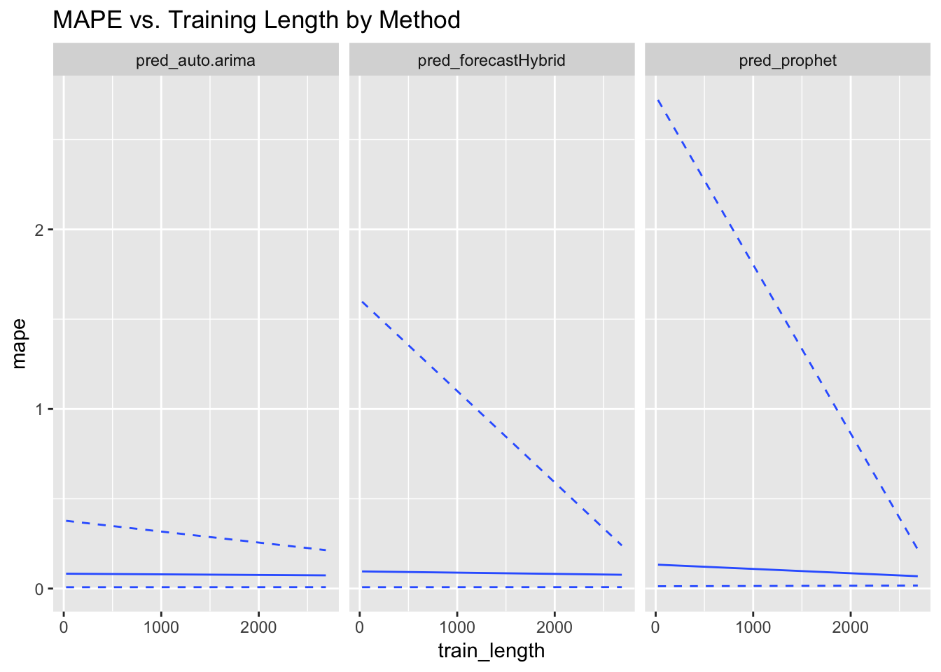
Here we see clearly that auto.arima is relatively insensitive to the amount of training data available and performs well throughout, whereas forecastHybrid and especially prophet perform much worse on small training sets. At the highest levels of training data, prophet does quite well. Let’s look at sensitivity to test period length.
ggplot(data = model_results, aes(x = test_length, y = mape)) + geom_quantile(quantiles = c(0.5)) +
    geom_quantile(quantiles = c(0.05, 0.95), linetype = c("dashed")) + facet_grid(~forecast_method) +
    ggtitle("MAPE vs. Test Length by Method")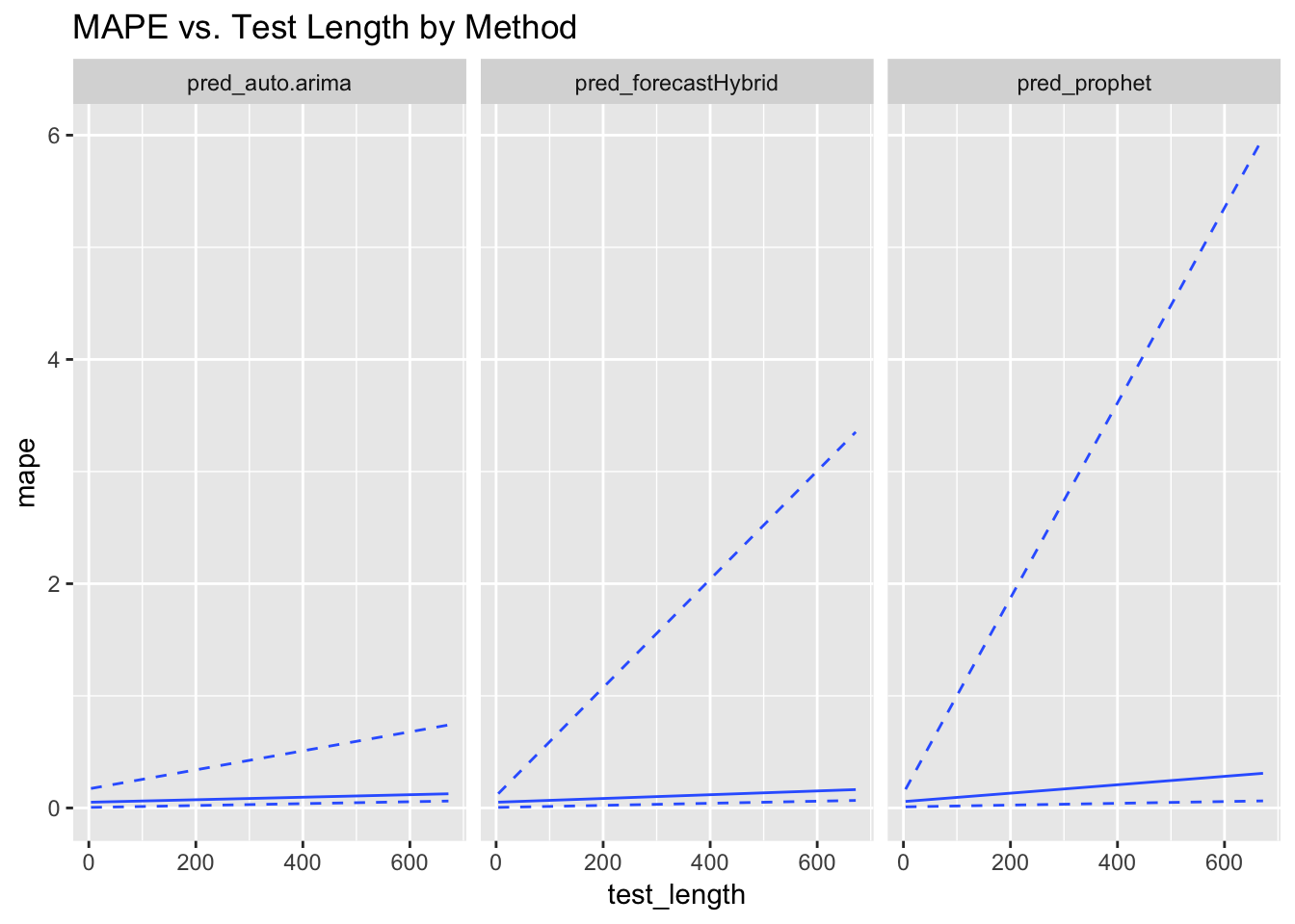
The marginal MAPE values along the number of test periods has the opposite trend as they do along the number of training periods. All the methods degrade as the test length increases, which is not surprising, but prophet degrades significantly faster than the other two methods.
Prediction Interval Accuracy
To do anomaly detection on unlabeled time series data, having a reliable means of generating prediction intervals is extremely valuable. Good prediction intervals should contain the test data points about as often as the confidence level chosen, and should not overestimate the interval width. Let’s see how the three methods perform in this regard.
ggplot(data = model_results, aes(x = forecast_method, y = interval_accuracy)) +
    geom_violin(aes(color = forecast_method)) + facet_grid(train_length ~ test_length,
    scales = "free", labeller = label_both) + theme(axis.text.x = element_text(angle = 90,
    hjust = 1)) + ggtitle("Interval Accuracy vs. Method by Training and Test Lengths")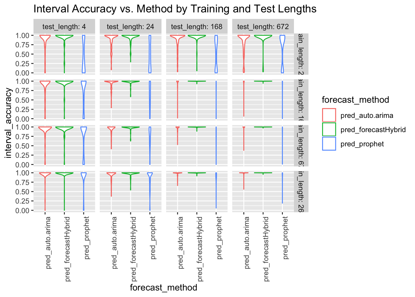
Outliers in the results for interval accuracy make it difficult to assess the accuracy around the nominal confidence level chosen in this study, 0.95. Let’s zoom in on the average interval accuracy by number of training periods. In these views, the three lines represent the .05, .50 and .95 quantiles for the percent of forecasted points containing the test data points.
ggplot(data = model_results, aes(x = train_length, y = interval_accuracy)) +
    geom_quantile(quantiles = c(0.5)) + geom_quantile(quantiles = c(0.05, 0.95),
    linetype = c("dashed")) + facet_grid(~forecast_method) + ggtitle("Interval Accuracy vs. Training Length by Method")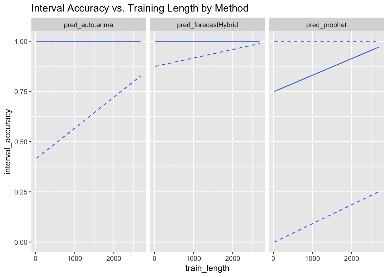
Here, it appears that auto.arima and forecastHybrid are far too liberal with their prediction intervals across a wide range of training period lengths. Prophet, on the other hand, is in the ballpark of 0.95 for most training set sizes, though with considerable variance. What if we focus on test set lengths?
ggplot(data = model_results, aes(x = test_length, y = interval_accuracy)) +
    geom_quantile(quantiles = c(0.5)) + geom_quantile(quantiles = c(0.05, 0.95),
    linetype = c("dashed")) + facet_grid(~forecast_method) + ggtitle("Interval Accuracy vs. Test Length by Method")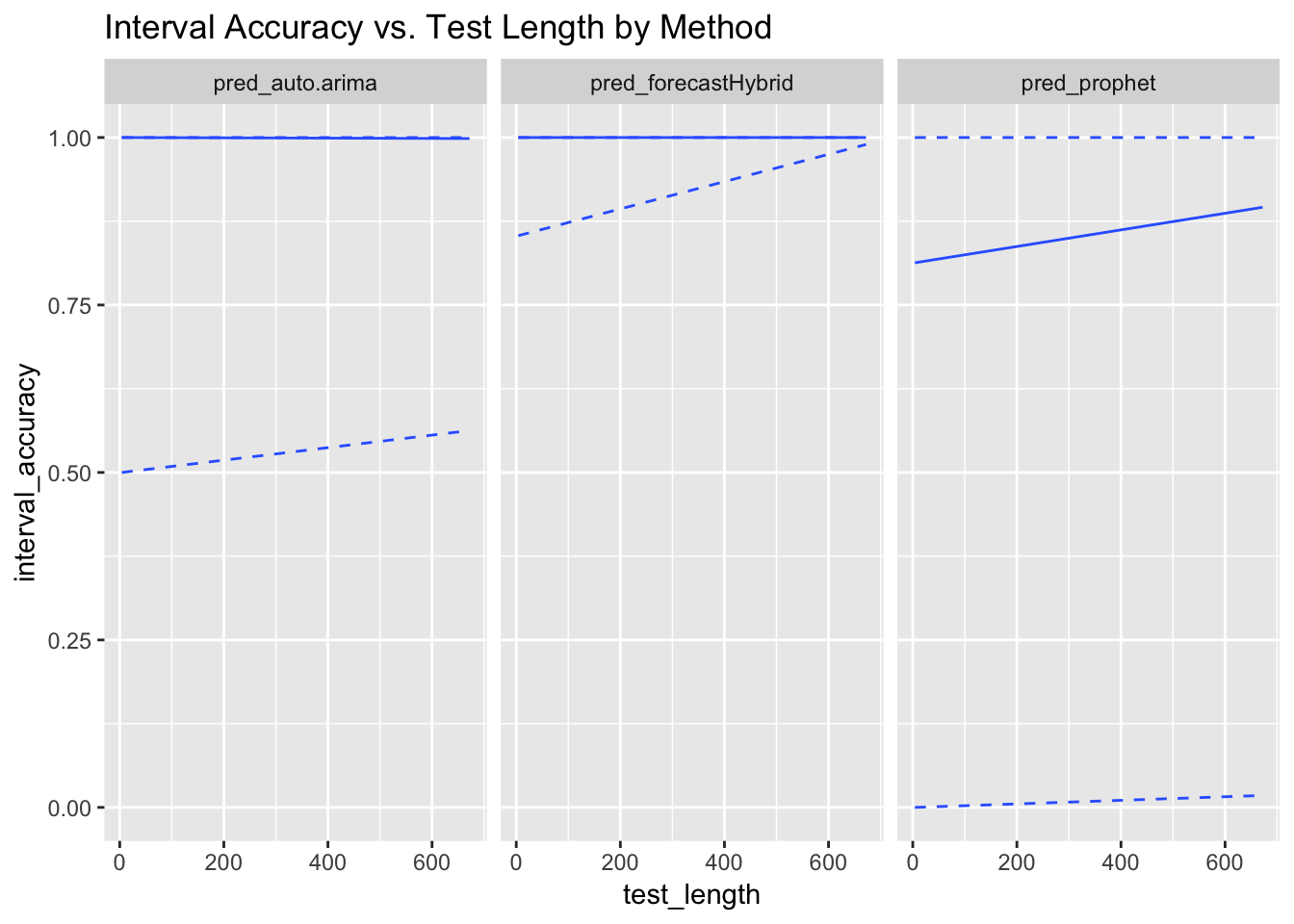
The results are the same as before, though unlike with the point forecast accuracy, Prophet actually gets more accurate with the interval widths as the test set size increases. forecastHybrid, on the other hand, seems to make trivially large intervals.
Sensitivity to Anomalous Data
One could reasonably ask whether there were some artifacts in the raw data that caused any of the methods to perform particularly poorly. If so, these would show up in plots of the forecast accuracy over time.
source("scripts/compare_forecasts.R")
fn_convert_datetime_to_datehour = Vectorize(fn_convert_datetime_to_datehour)
model_results$date_hour = fn_convert_datetime_to_datehour(model_results$split_time)
model_results$split_date = as_date(model_results$date_hour)
model_summaries_by_date = model_results %>% group_by(forecast_method, split_date) %>%
    summarise(mape_avg = mean(mape))
ggplot(data = model_summaries_by_date, aes(split_date, mape_avg)) + geom_col() +
    facet_grid(forecast_method ~ .) + ggtitle("Average MAPE by Date of Train/Test Split")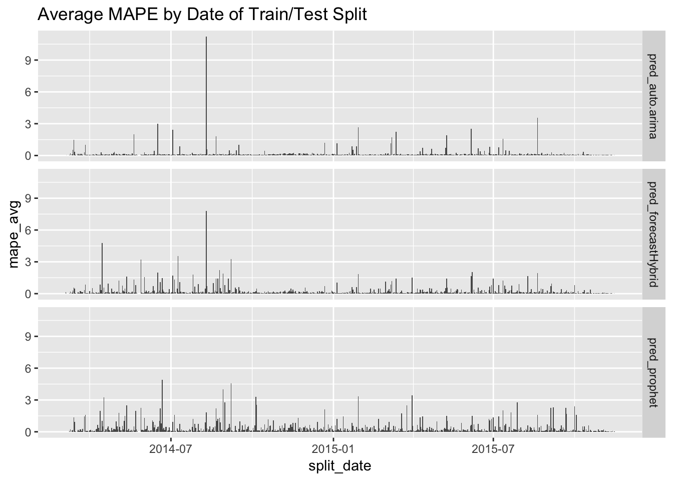
Here, we see that auto.arima and forecastHybrid were most affected by some extreme events in August/September of 2014, but otherwise had generally good performance. Prophet, on the other hand, had few extreme errors but had consistently higher errors than the other two over the course of the study period. So…at least it’s consistent!
Conclusions
First, a reminder of the criteria we defined at the outset:
- Forecast accuracy
- Prediction interval accuracy
- Fitting and forecast speed
- Reliability when using at scale
It was somewhat surprising that Prophet performed worse than the other two methods in three of the four dimensions - all except for prediction interval accuracy. Its point accuracy was lower, it caused the simulations to crash repeatedly, and it was the slowest of the three methods in fitting models. However, it did considerably better on prediction interval accuracy, which reinforces its value as an anomaly detection tool.
To be fair, the data we chose didn’t play to Prophet’s strengths: no holidays, no missing data, minimal long-term trends. This data was quite periodic, so an ARIMA model might actually make the most sense. In previous work, I’ve seen ARIMA work well on weather models, so this is not totally surprising. Sometimes, simpler is better! However, generally speaking, it is good practice to use model averaging over multiple reasonable models. Indeed, Rob Hyndman (creator of the forecast package, which includes auto.arima) points this out when reviewing the forecastHybrid package.
These results should not be interpreted as any kind of conclusive judgment that one method is better than another. It can be interpreted, though, to mean that some methods suit some problems better than others, so you can’t get rid of the experts too quickly!